Bramble
Brand design package for a new company that brings together interior design and an online store.
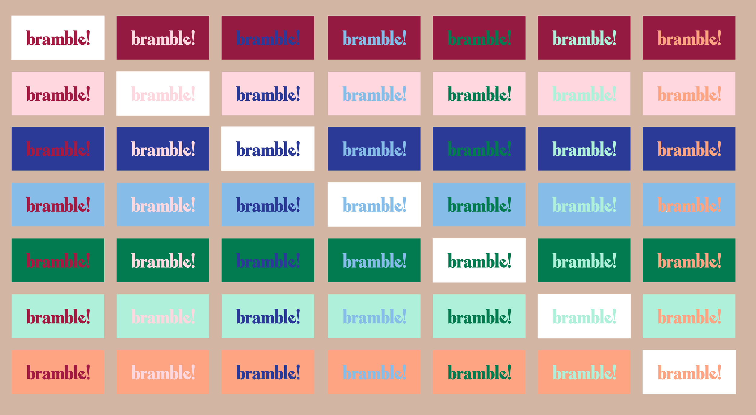
The logo is simple, elegant & recognizable. The vertical strokes on the ‘b’s, the ‘l’ and the ‘!’ have been slightly stretched vertically. This, together with the use of the exclamation mark makes it look like the word is being yelled. The tilted ‘e’ gives a more casual and fun approach to the seriousness of the serif font.
Flexible enough to mutate into multiple identities.
The exclamation mark in the logo is used both as the brand mark and as a pattern used throughout the physical mockups in a playful way.


